The boring badge ribbon has proven functional at many professional gatherings. Keep this in mind when choosing badge ribbons as they are meant to improve the effectiveness of a name badge. The five previous tips were aimed to help decide which type of badge ribbon was the best for each ribbon project. Here are five more tips to help with the overall design of any badge ribbon.
TIP #6 Avoiding Boring Ribbons: Choose a distinctive font.
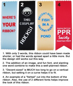
The easiest way to drastically improve how your ribbon looks, and to keep it from being boring, is by using a nice font. There are many fonts available that will meet most any need. Keep in mind that most fonts will require a metal die.
Badge ribbon printing requires the use of dies, which are made to imprint onto the ribbons. A die is basically like a stamp as it presses a printing foil down on to the badge ribbon. Wherever the stamp touches the foil to the ribbon, the foil will stay printed, or dyed, onto the badge ribbon.
Many badge ribbons may be printed using a polymer die. Polymer dies are faster and less expensive, but they do have a few drawbacks. They are made from a softer material than metal dies; they also wear out quickly, so they can’t be used for large runs of the same ribbon; and they don’t hold detail well, so only thick, plain letters and shapes can be used. Small holes in the design, like the inside of a letter “a” or “e” may fill in because the die can’t press hard enough to ensure a clean impression.
A metal die, which is much stronger than the polymer die, can hold much more detail and will ensure a much cleaner imprint. Using a metal die no longer limits the choice of font; text may be made smaller or even add a logo or other image. Metal dies give much more freedom in the design of a badge ribbon and are well worth the additional cost. They can also be saved to use again and again.
TIP #7 Avoiding Boring Ribbons: Have fun with your text.
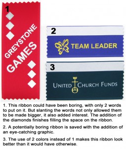
 Text doesn’t have to be boring like straight side-to-side or up-and-down. Depending on the badge ribbon chosen, the text can be set at an angle or even on a curve. This is a great trick to get longer words to fit on a narrower ribbon and doesn’t always require a metal die.
TIP #8 Avoiding Boring Ribbons: Don’t limit yourself to one color.
For a better looking badge ribbon, use a combination of colors. A plain badge ribbon suddenly seems less boring when changes to a few elements are made. If the badge ribbon really needs to make an impression, try a Full Color Custom Ribbon. This badge ribbon will be printed in full color and has no limits to fonts or number of colors and no metal dies. You can even get a photograph printed on these badge ribbons.
TIP #9 Avoiding Boring Ribbons: Plan the shape and size of your ribbon.
Each ribbon should take content and function into account when adjusting the length or shape. If there is extra empty space, make the ribbon smaller or request options for making the text fill it better. Each badge ribbon should fit the text comfortably and not be crowded or empty. Make the badge ribbon unique by replacing the pinked ends with a fishtail.
 TIP #10 Avoiding Boring Ribbons: Add a company logo.
Nothing spices up a badge ribbon like an image. Use a company logo or find a basic image that will set off the design on the ribbon; it will instantly increase the ribbon’s appeal. Remember, a metal die will be required.
So the next time you find yourself in need of a ribbon for that upcoming event, keep these 10 tips in mind and the planning stages should be a bit easier and more enjoyable.
*Tips and graphics provided by guest author Melanie Bunch, Graphic Artist at Coller Industries.*
